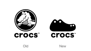
Wow it’s so simple now… it looks cool.
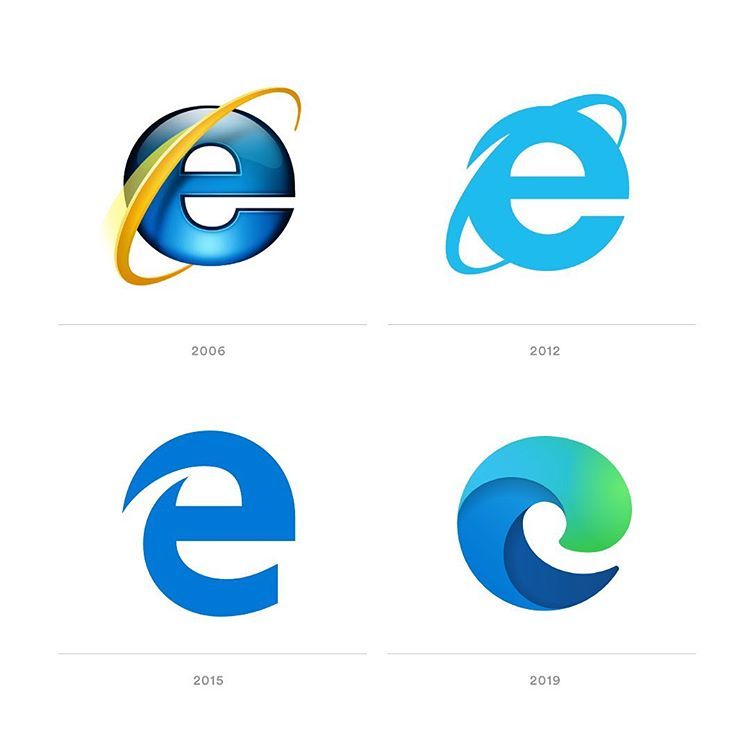
Wow it’s so simple now… it looks cool.
It has become a trend for many companies to start simplifying there logos but why did this trend start and what dose it all mean? I believe that this trend has picked up because cleaner and simpler can mean elegant and more important. This hasn’t only been a trend in the web design world of in fashion, interior design, and even beauty.
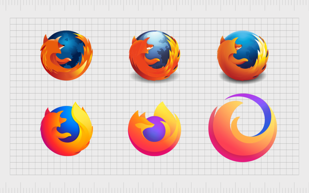

As an art student there are many exercises done to improve your own work. One of these exercises are, making a replication of a painting you have finished and spent a lot of time on. The catch is you have to replicate it with the biggest brush you have. Once the student dose this many think the painting looks better this way. I feel the same thing is being done in the design industry. Simpler and cleaner is better only if you can communicate the personality of your brand correctly.